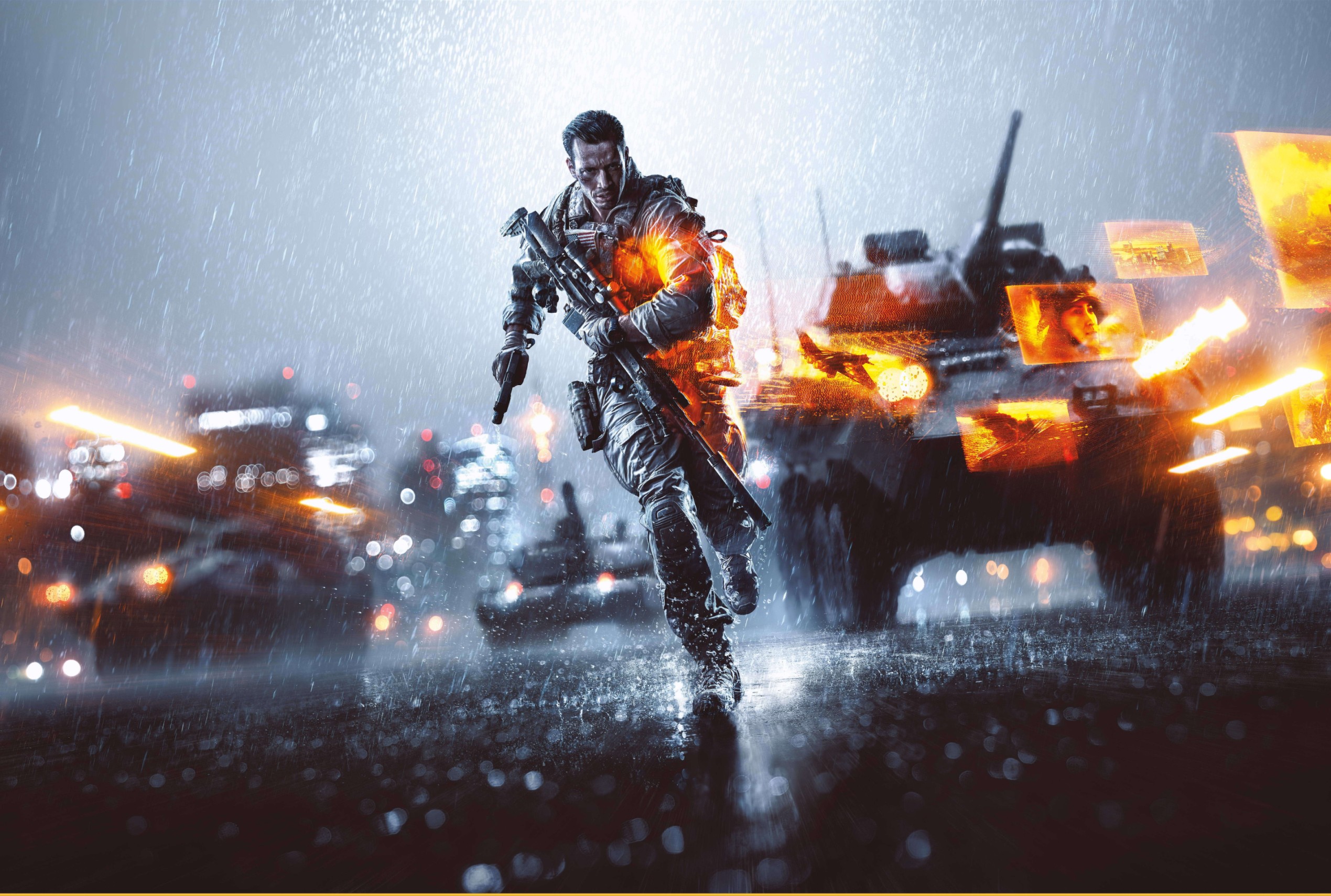
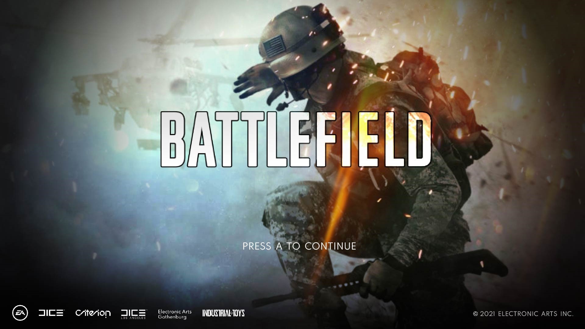
BATTLEFIELD
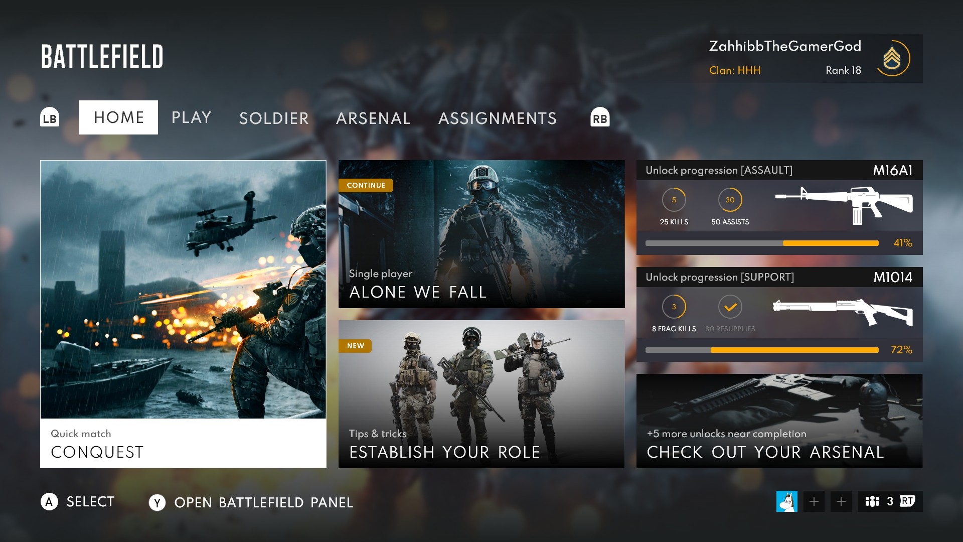
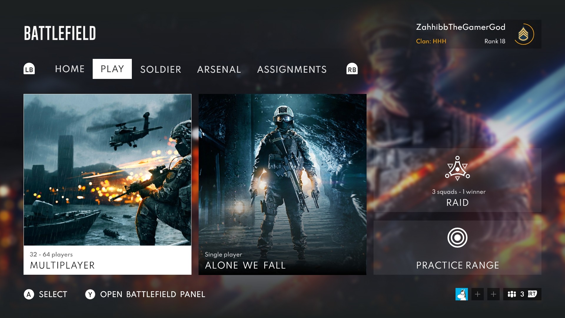
UI MENU MOCKUP
UI
References
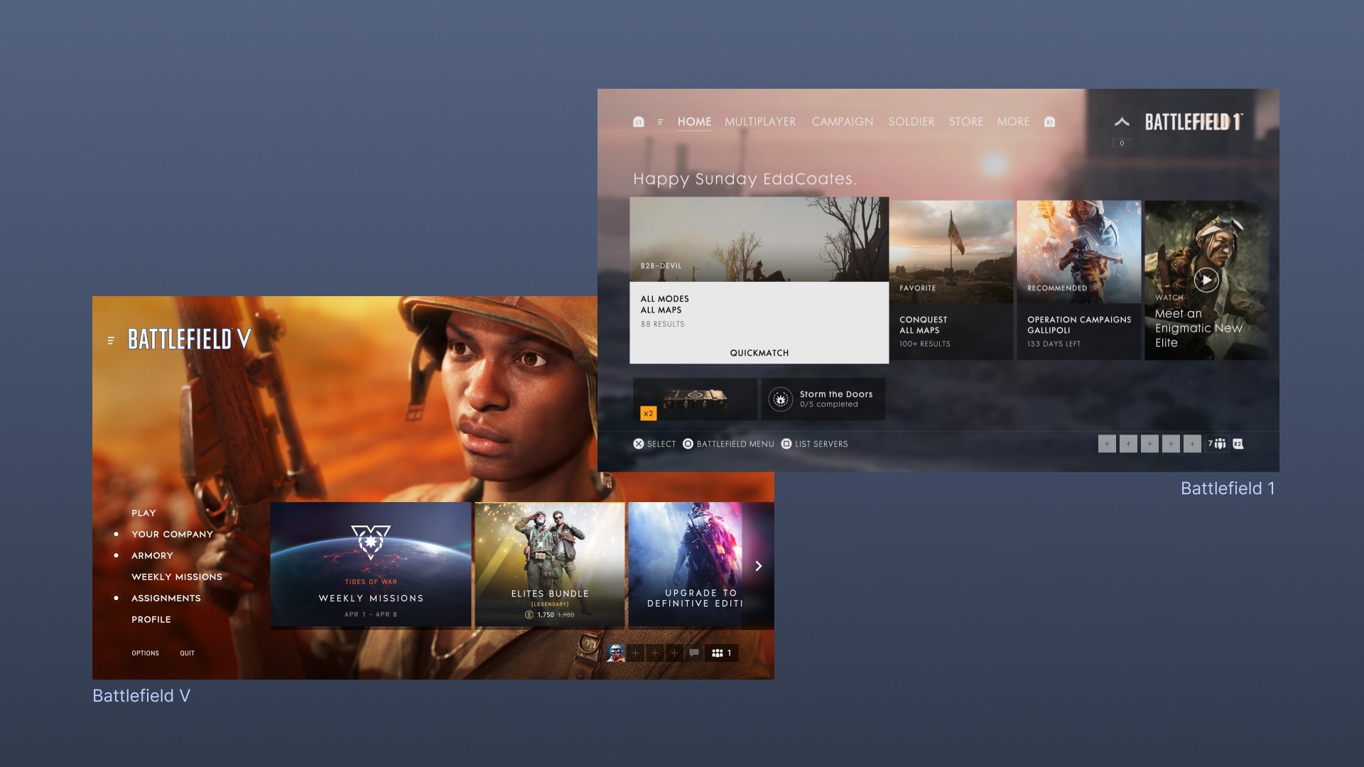
By looking at previous Battlefield games' menus and breaking down their layout I could find common design patterns that I could utilize in my designs.
In this particular case I looked at the most recent games; Battlefield V and Battlefield 1, mainly to keep in line with how these now more modern UIs would feel and function.
The primary, obvious takeaway from this was to either go for horizontal or vertical navigation while still keeping to the blocky element designs.
Grayboxing
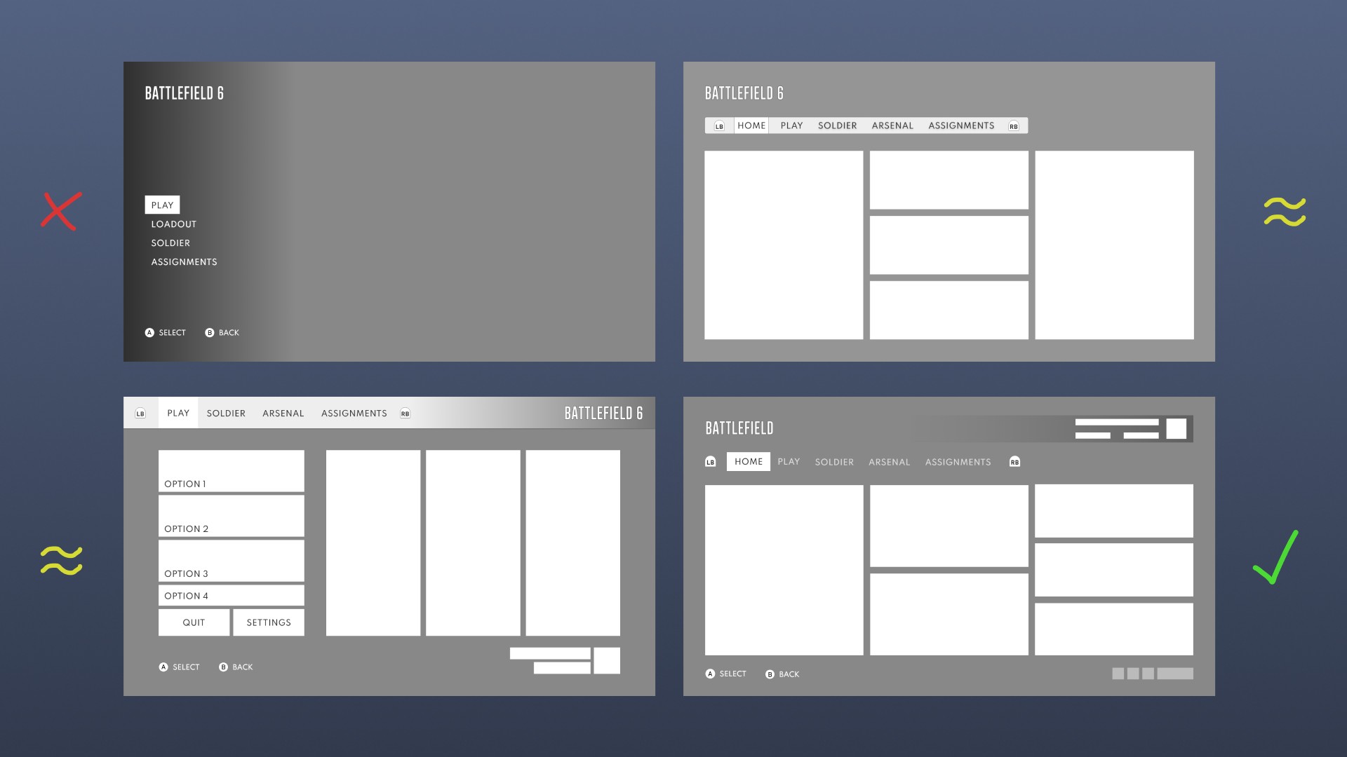
Without pause, I dove into my favorite part of the design process — grayboxing/low-fidelity wireframing!
My process was to create quick, unprecise, and iterative block-outs of various layouts I had in mind to find something "new", but also recognizable. In the image below are some of the wireframes I declined, considered, and went with.
The main issue with my approach here is that I should have first created site maps, flow charts, and user flows to find potential pain points in navigation and approachability.
Stylesheet & Assets
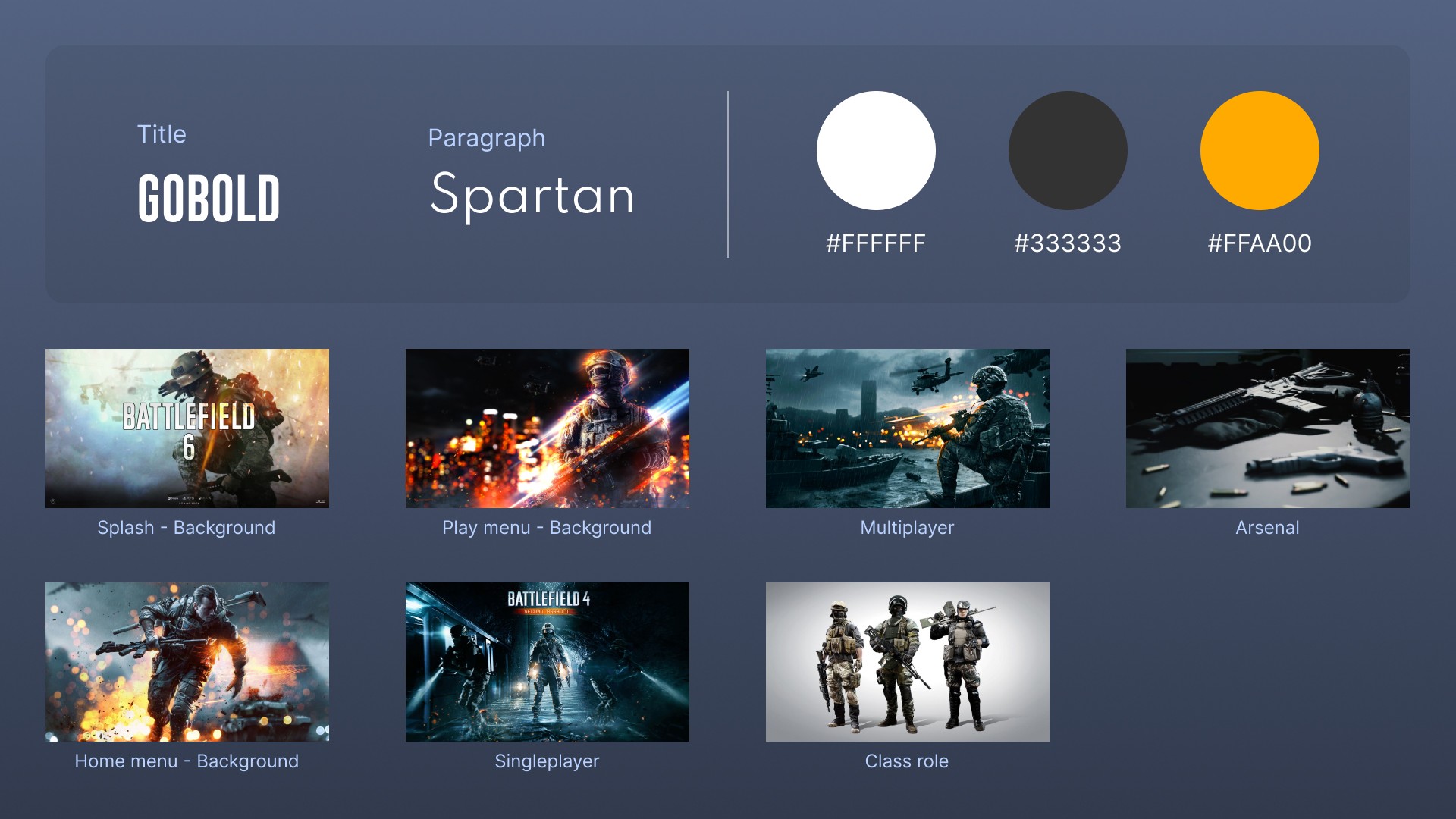
For the typography, I went with Gobold, which is quite similar to the font that is used on the primary logo/header of the Battlefield franchise, and Spartan which is simply a font I find beautiful.
For the colors I primarily used 3 colors; pure white and dark grey for solid contrast colors, and bright orange as a "flagship" color that serves as the primary color of this specific imaginary title.
The various assets I used are credited at the bottom of this project page.
Closing thoughts
In the end, I had a great time working on this short project; trying out new tools, considering my design decisions, applying layouts/ideas used by other game titles in the genre, and seeing What and Why things work.
Overall I am happy about the results, even though it lacks a great deal of reasoning on why I made some choices and there's no research behind it.
Some of the things I need to work on going forward:
Involve planning and research into my projects.
Create design systems and reusable components.
Focus on finding issues to solve instead of simply creating beautiful UIs — I need to set a proper direction.
