ELDEN RING
UI MENU MOCKUP
UX
UI
Defining data & grayboxing
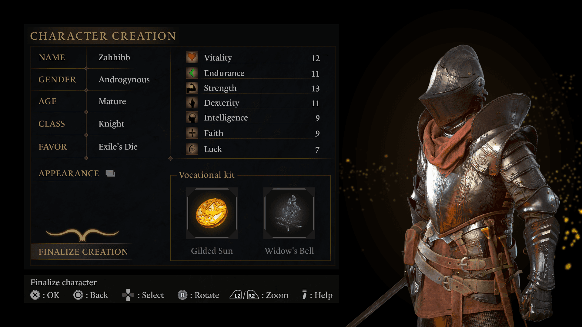
I began this project by breaking down and sorting the information provided and I looked at previous FromSoftware game titles' UI and what data they usually contain.
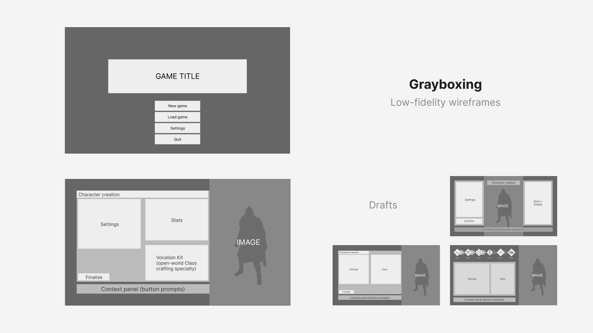
By determining these details I then formulated my plan on where this data would positioned by both sketching and producing some low-fidelity wireframes.
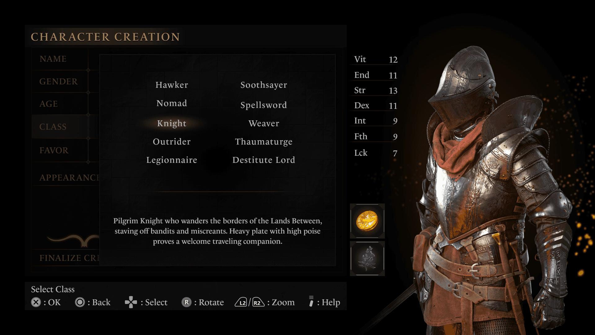
The main premise of the layout was to be separated into 3 columns:
Settings
Stats
Character model.
Visual direction
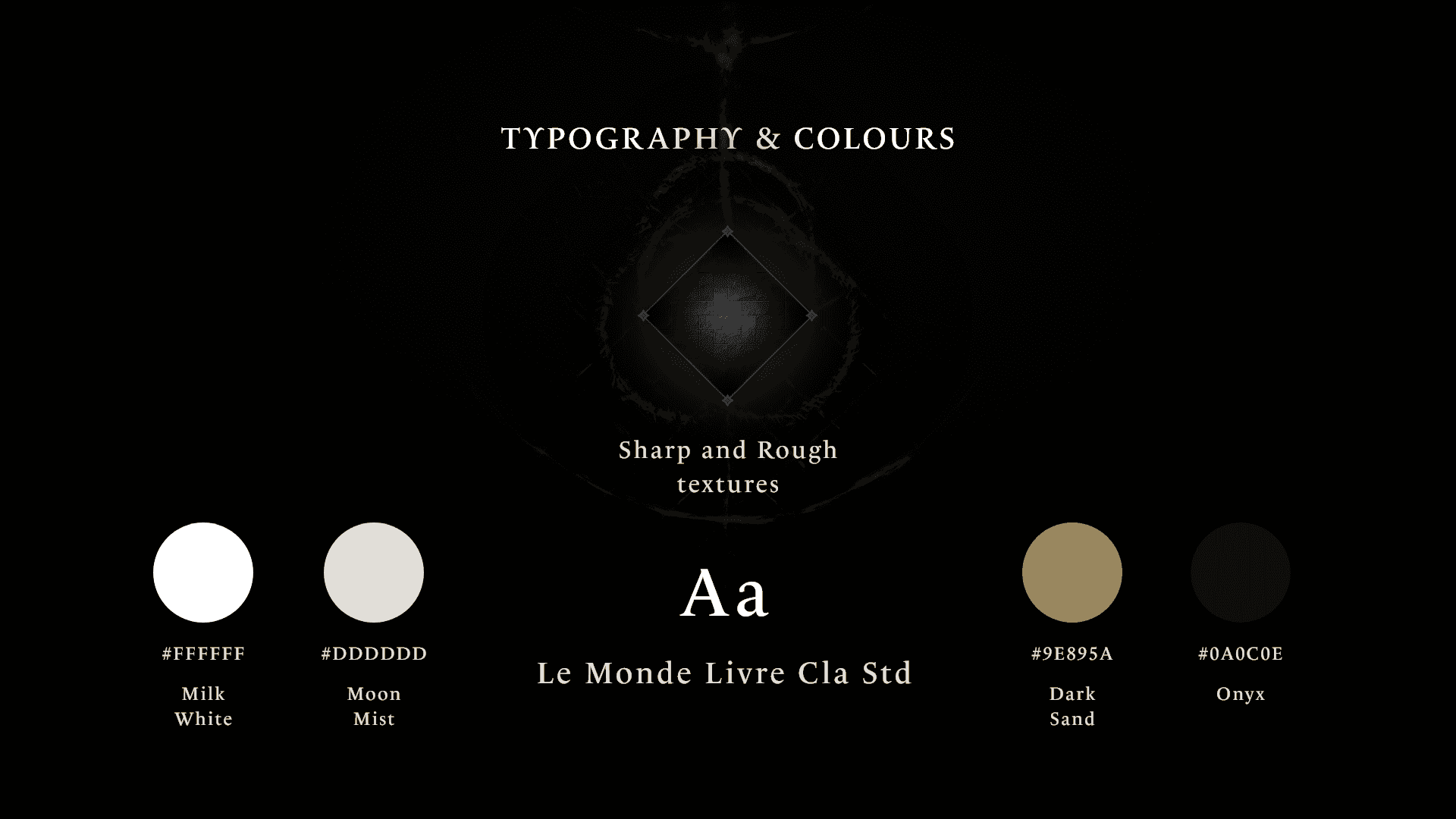
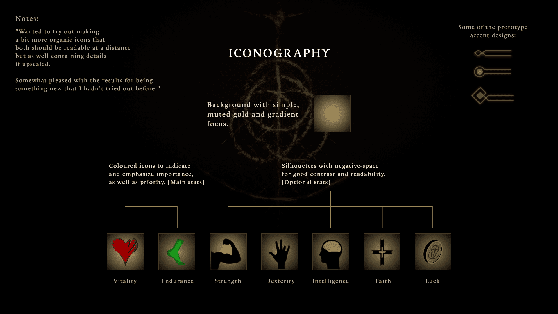
After I had decided on the layout and positioning of elements I dove right into setting up a stylesheet; colors, patterns, textures, typography, and iconography.
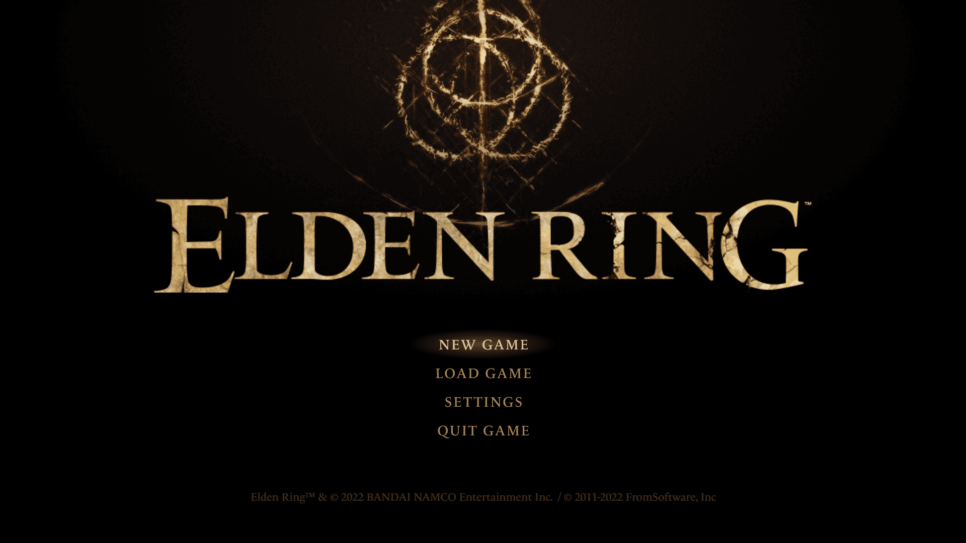
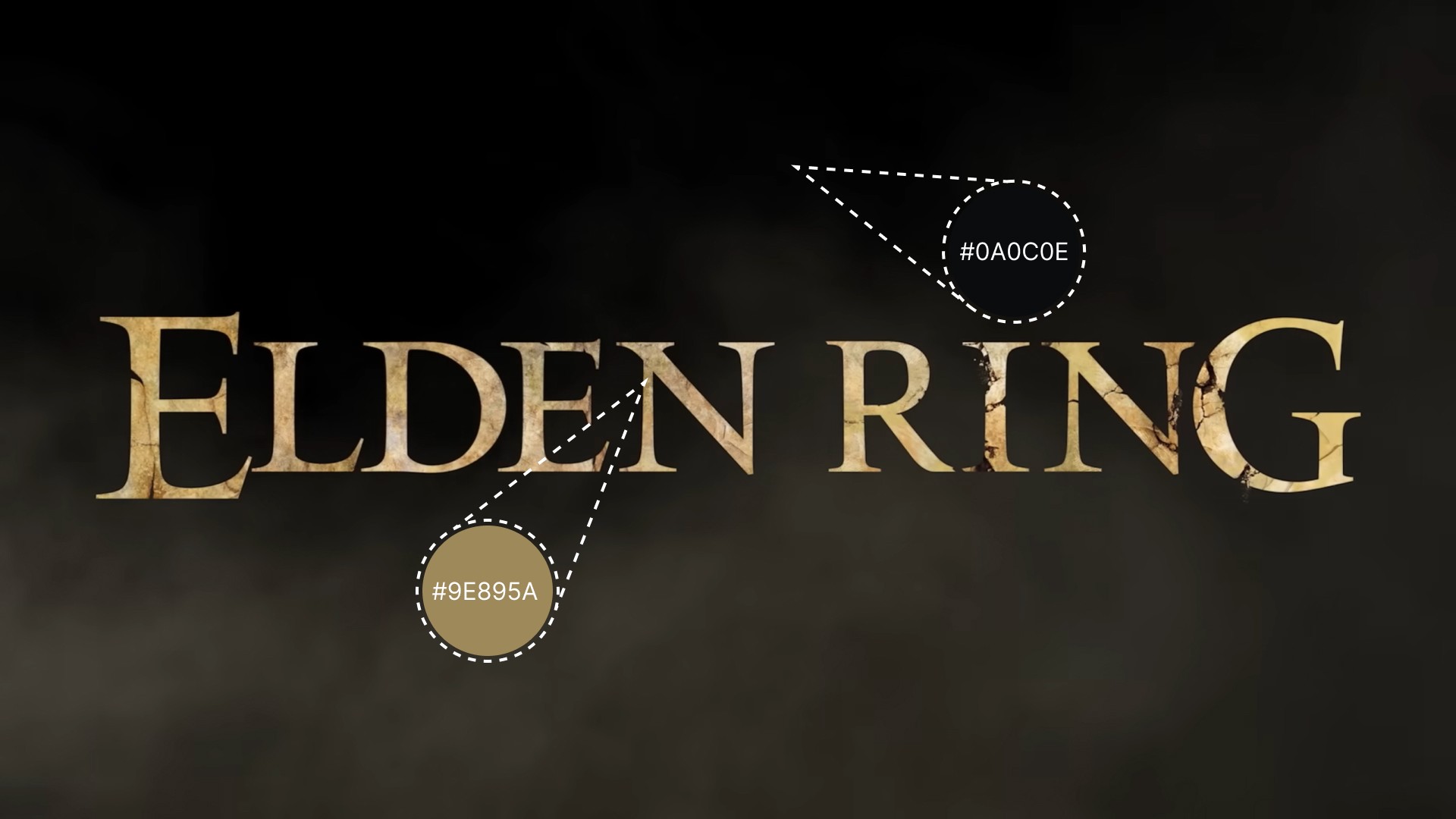
I decided to make use of the colors present on the Elden Ring text logo to have some already established base and primary colors.
For ornamentals, I wanted some non-intrusive sharp angles while also adhering to the visual style I set up to use a gradient brushed metal style — much of this to try to keep the visual language intact of what people would expect from a FromSoftware title.
Final thoughts & takeaways
Overall, I found this short project fun and nurturing, deepening my understanding of both tools and workflow as well as enabling me to further consider and be more self-critical of how I create future projects.
The most valuable thing to me at this point was to finish a project as I feel my skills in both design and software grow every time.
The next project will most likely be a bit larger in scope, mostly to allow me to go deeper into user-centric design in creating user journeys and looking for common pain points to solve.

