STRIDEN
UX
UI
GAME DESIGN
Production Ease-in
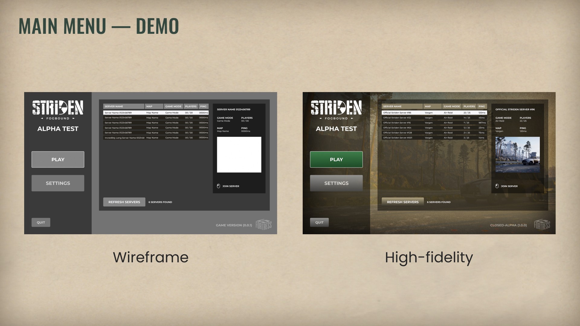
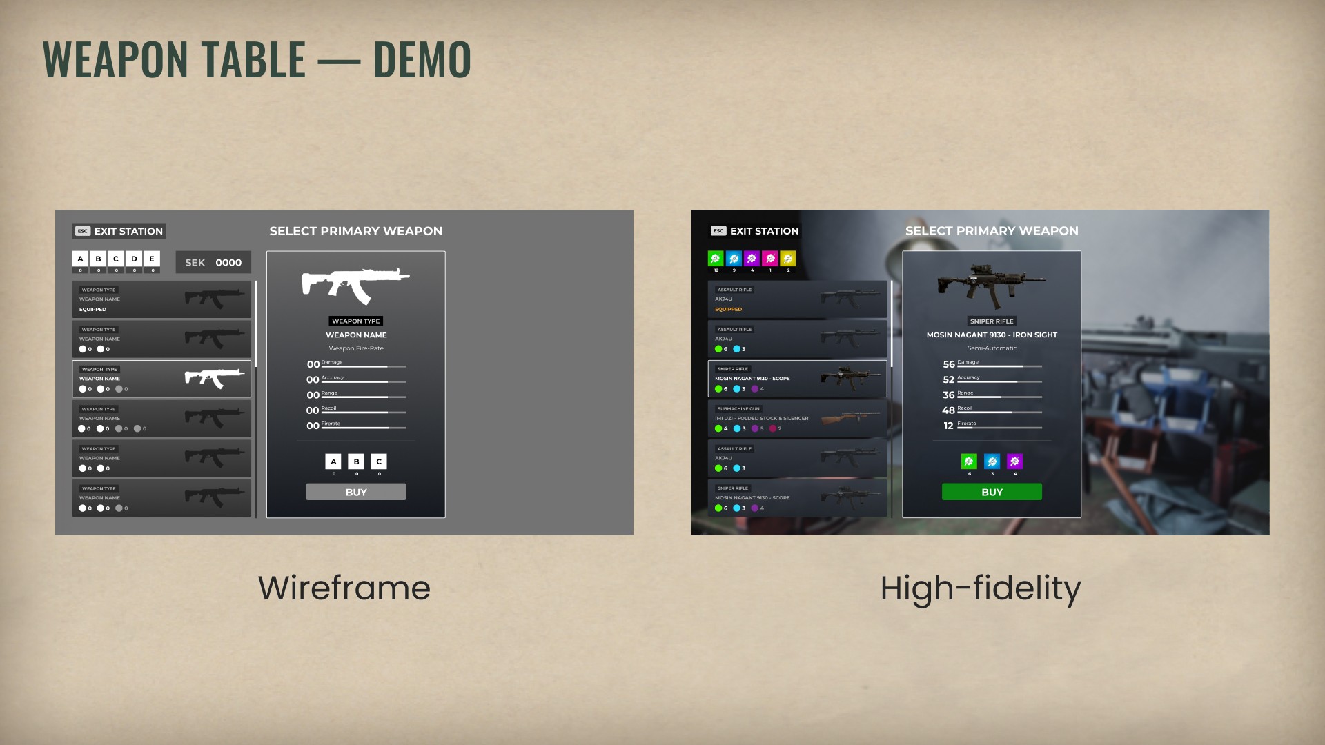
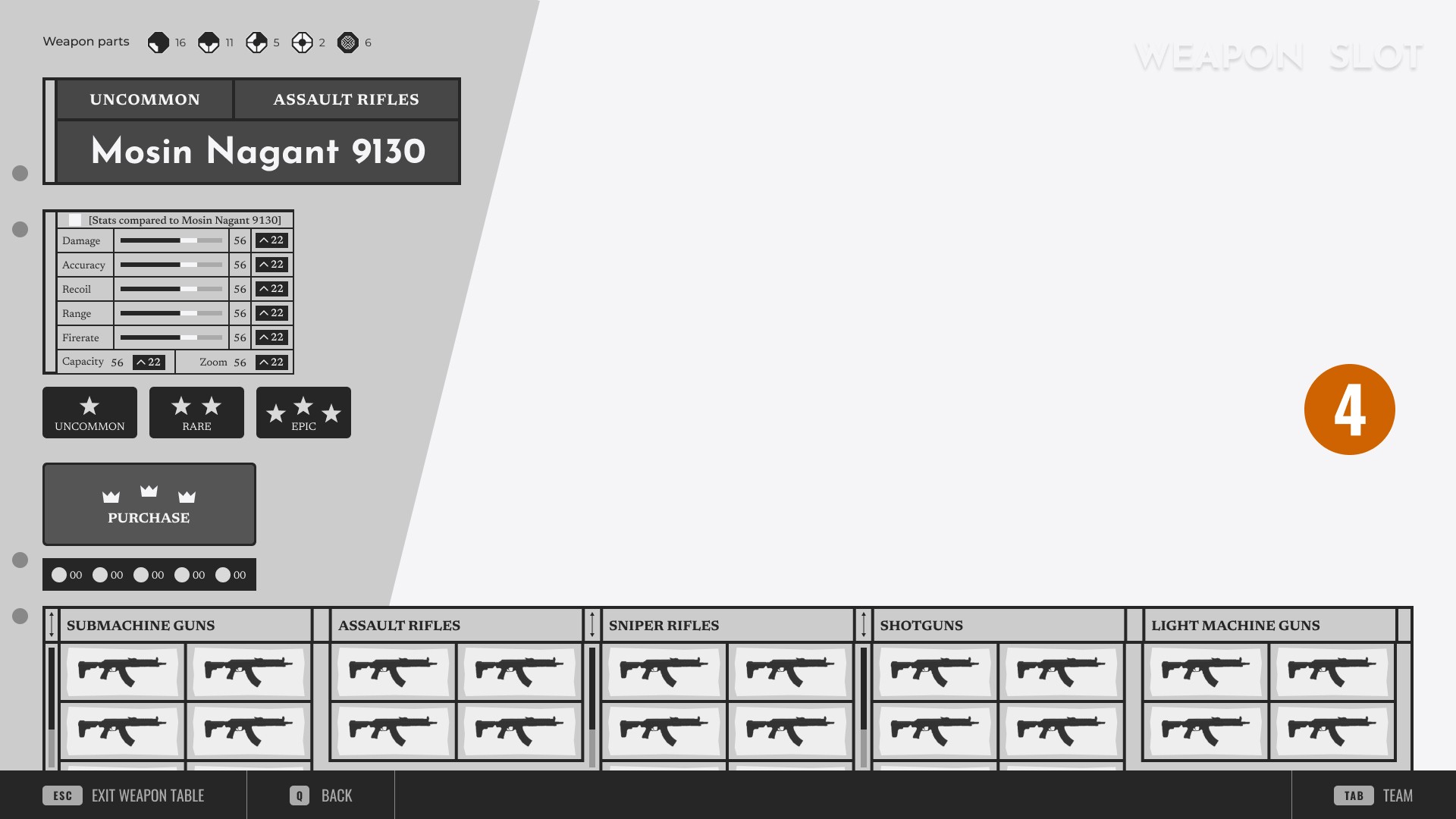
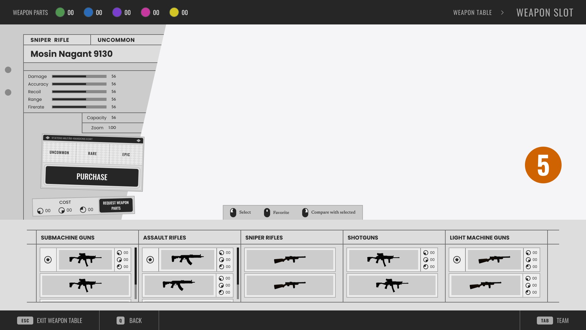
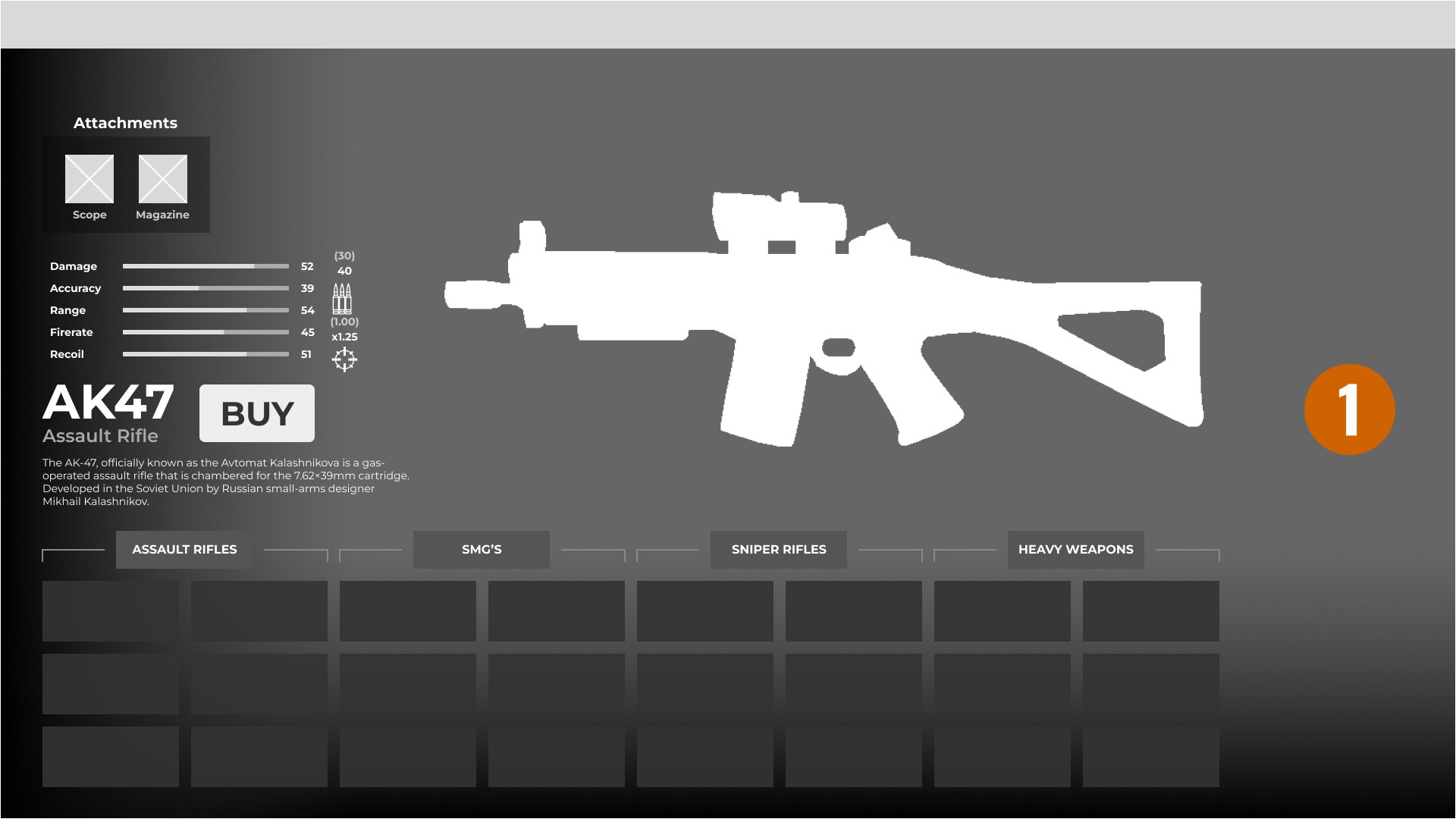
I began my internship (and a little time before that) by working on Main Menu and (In-game) Weapon Table designs for a demo/closed-beta variant of the game, as they were going to ramp up the playtesting with external partners and players in the coming weeks/months.
These designs of mine were made in a short amount of time and without any real considerations of a defined visual style. My workflow was here to initially ask a lot of questions regarding:
What data was required.
What settings/features were most crucial to be seen, and used.
and then quickly execute on what I had learned.
To me, basic questions can lead to advanced solutions.
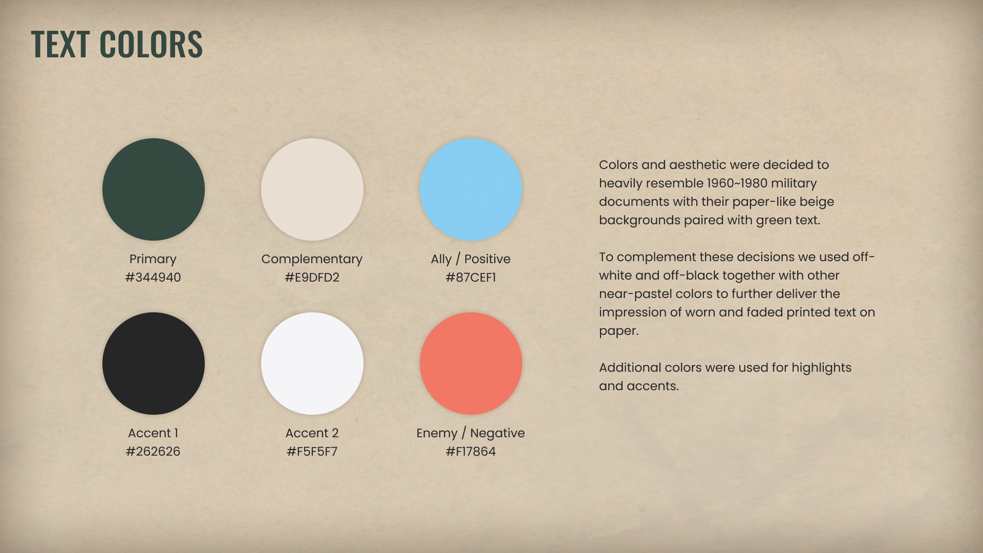
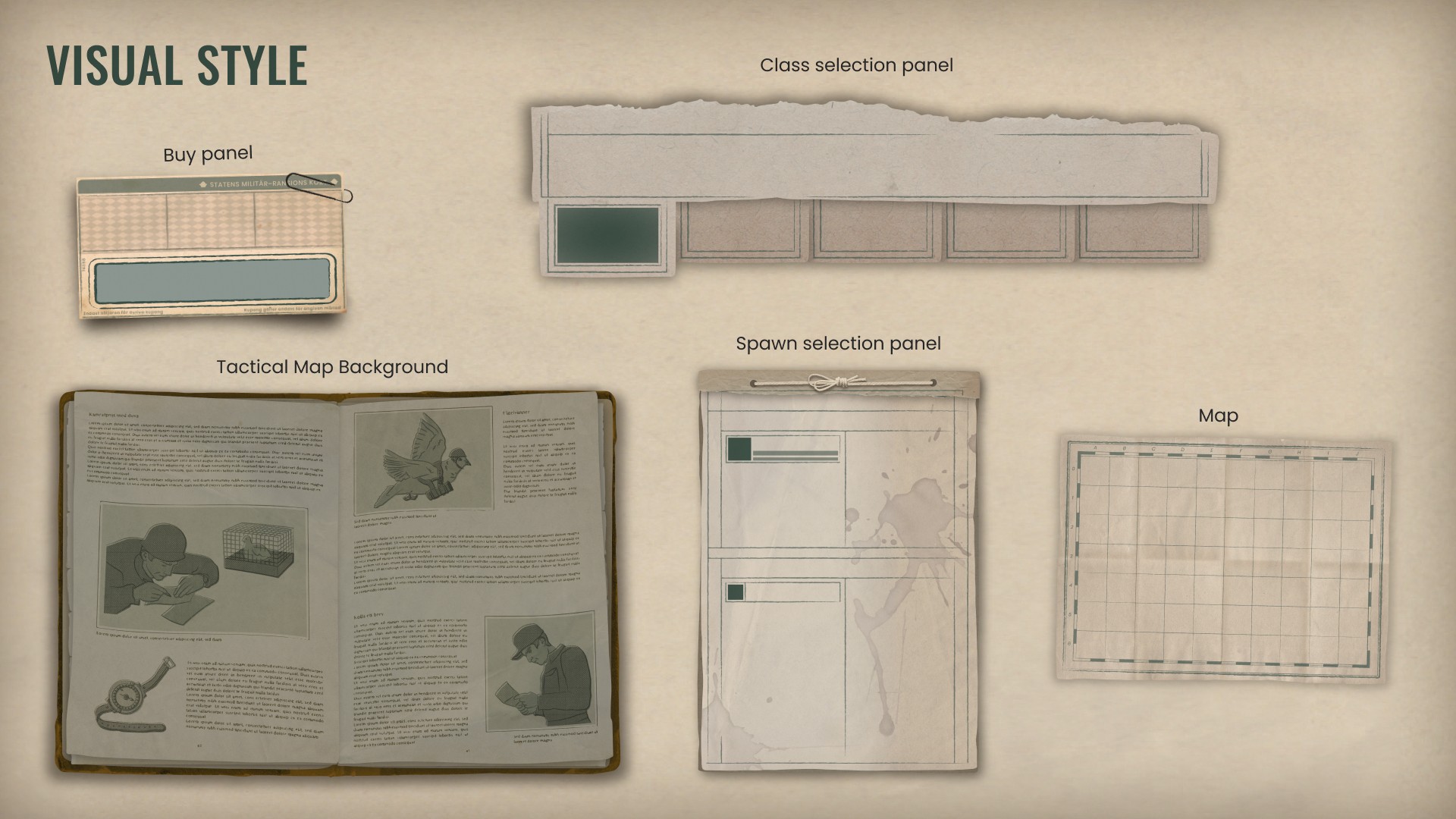
Defining style
- Visually distinct and immediately recognizable as Striden
- Readable and user-friendly to enhance the entire user experience
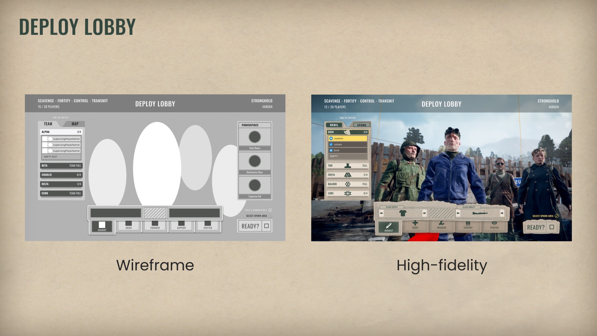
Weapon Table
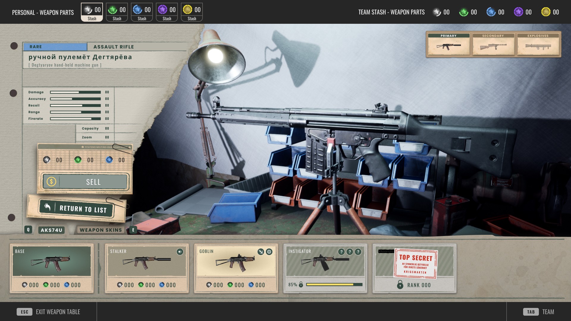
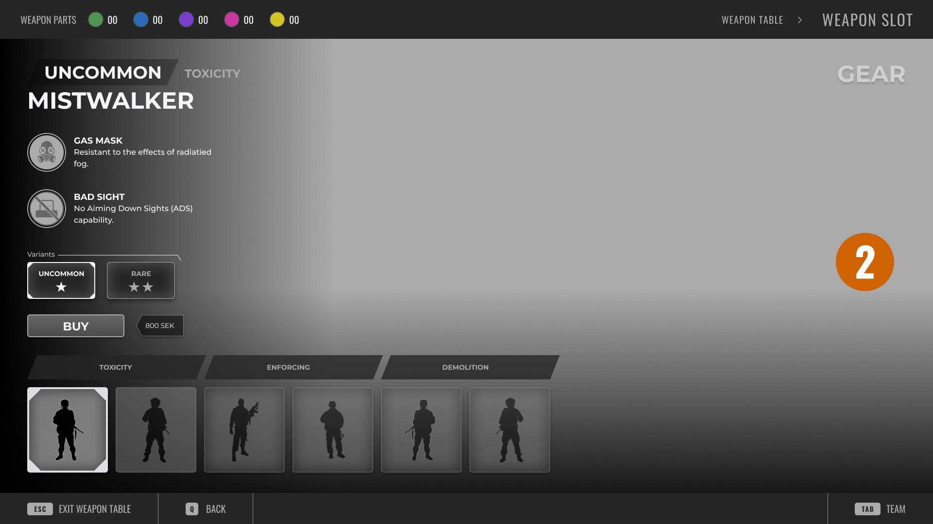
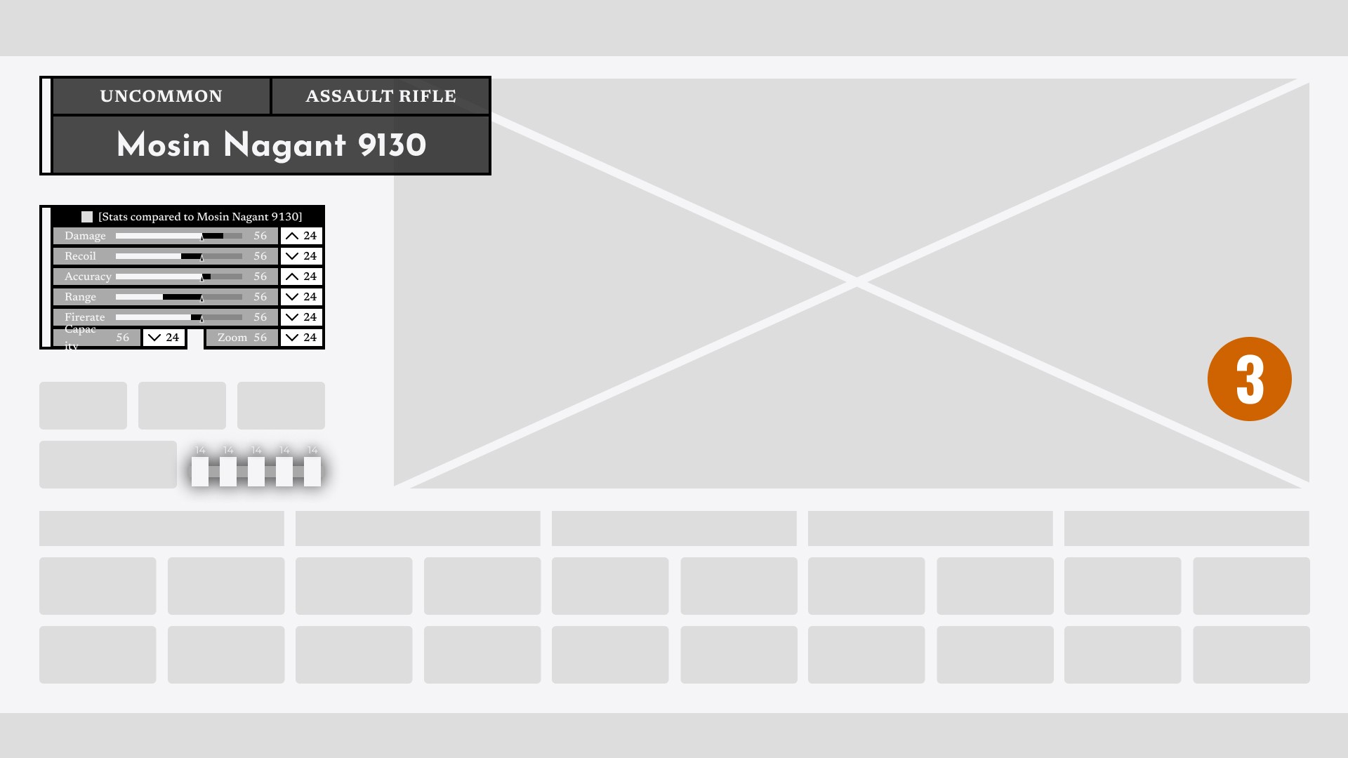
After familiarizing myself with the desired considerations and features for the demo version of the Weapon Table menu, I moved on to design the "real" version.
Key points:
Iterative Process: Constant feature and game design changes required multiple iterations.
Challenges: The design often became cluttered, hard to read, and used too many colors.
Outcome: Despite needing further refinement, we achieved a good aesthetic with grounded textures and broad elements. Issues with the amount of colors and alignment still remained and would be required to be additionally worked on in the future.
HUD screens, icons, & assets
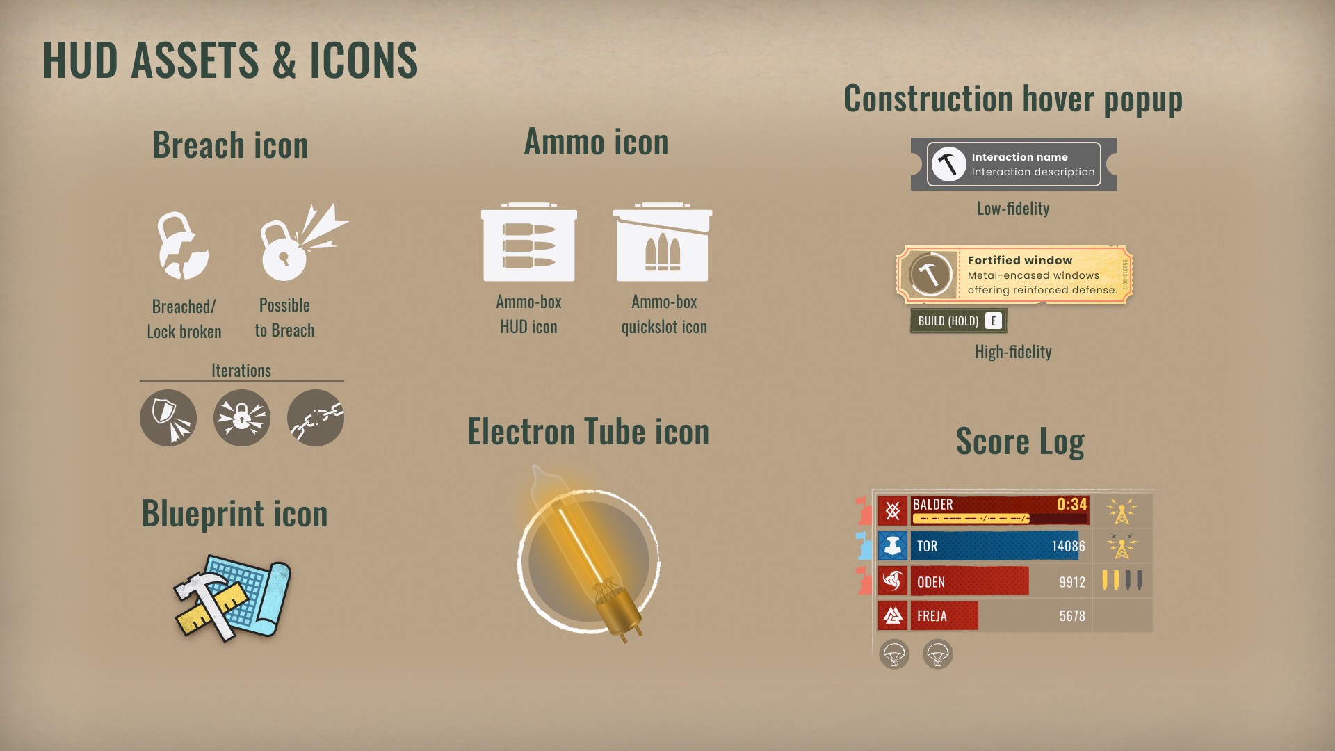
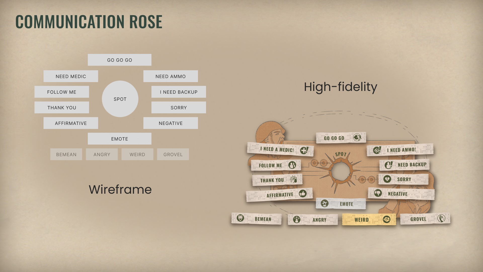
Continuously throughout the project I worked on various HUD mockups, prototypes, assets (kill feeds, interaction pop-ups, quick menus), and designed icons.
While I enjoyed the process while working on the iconography, it highlighted areas for improvement in my skill level. Consistency in shape, colors, line thickness, and overall aesthetic proved to be challenging.
Game loop & Crescendo
Overview
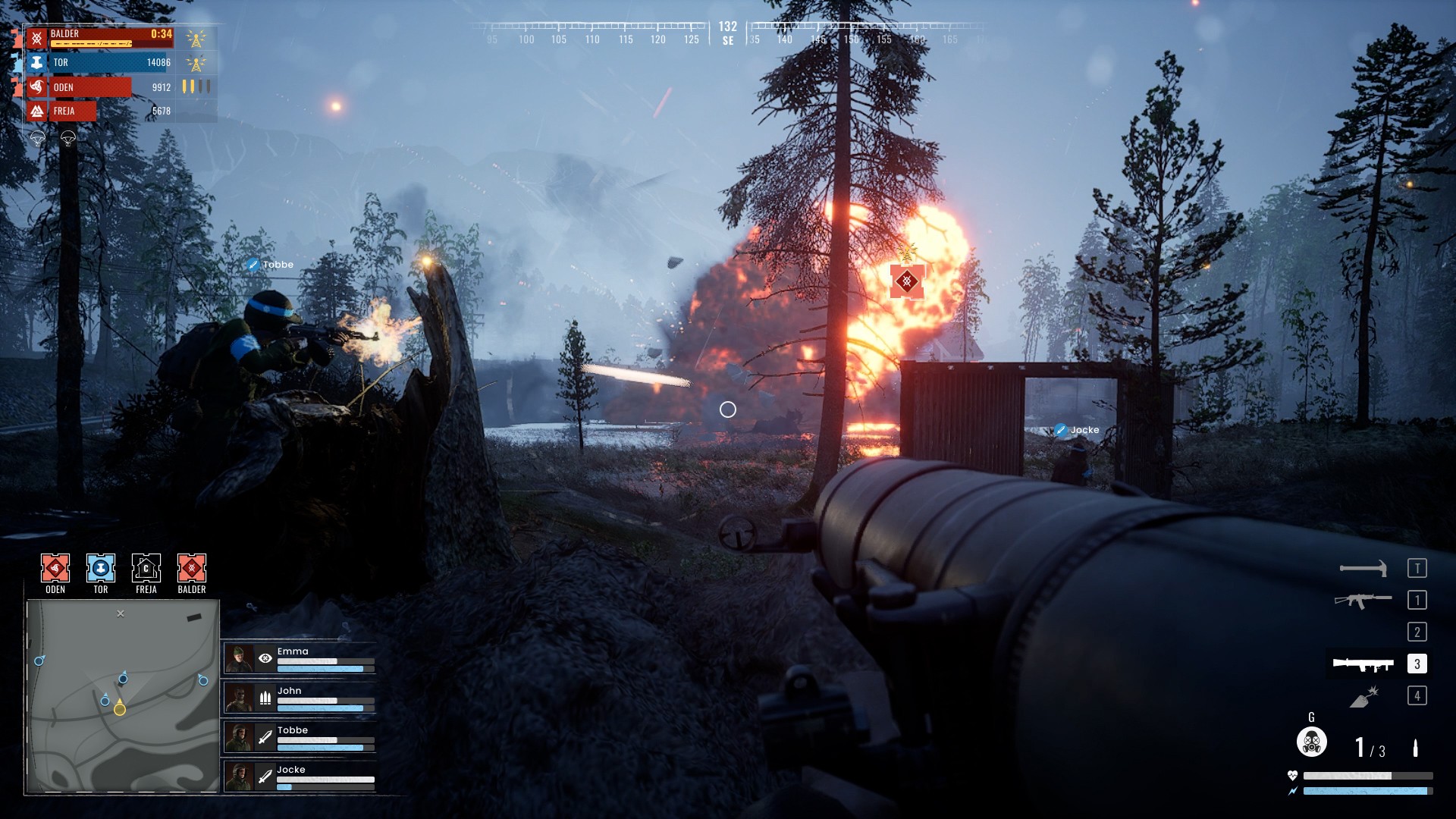
With the multitude of playtests we did each week, we were always on the hunt for a more definitive game loop, as we found the core gun gameplay fun, but the different gameplay phases we had didn't feel seamlessly integrated into each other.
Problem
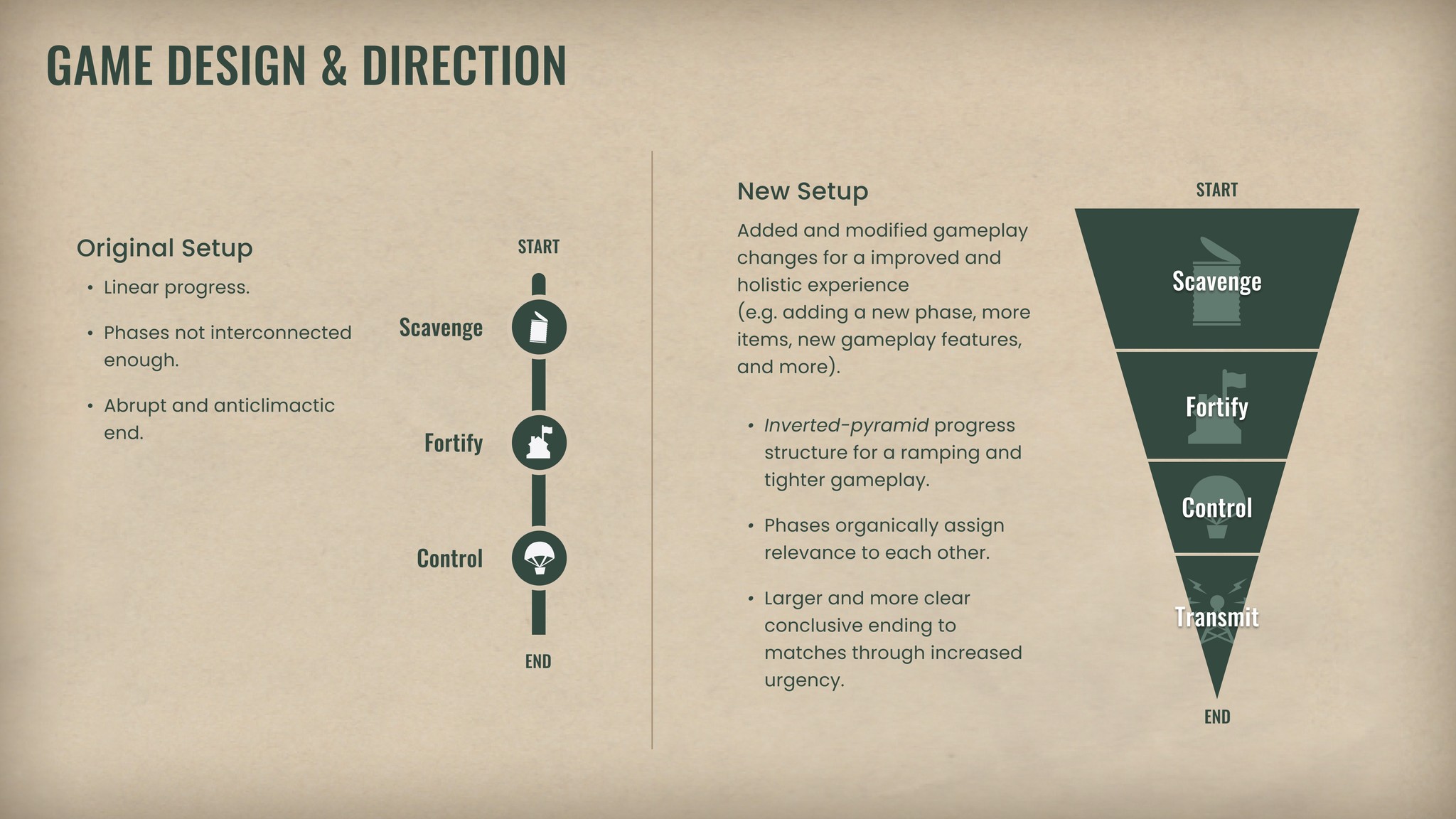
The premise was that we had 3 different phases leading into each other:
Scavenge — Looting (food, water, weapon parts)
Fortify — Capture a Stronghold and construct defenses.
Control — Seize the supply drops (A.R.Ms) to gain score to win.
To keep this succinct; the issue was the 3rd phase in that you simply fought for various supply drops without any kind of build-up towards the end. Only competing for score to win felt lackluster.
What we did
During our design discussions, I suggested to the team that we either include a sub-phase into the 3rd phase or add a final new 4th phase, that was dubbed the "Crescendo". This phase, now called the 'Transmit'-phase, would be influenced by players completing/performing the objectives of the 3rd phase.
What we required and made for this 4th phase were:
Narrative — Players need to organically understand why and when the match is going towards an end. We decided on the idea of gathering electron tubes to power a radio beacon that would then transmit an SOS signal for an extraction helicopter.
Urgency — Visuals, UI, sound, music, and gameplay elements should all serve to promote the increased importance of haste and tactical thinking.
Stronghold relevancy — We needed the Strongholds captured during early gameplay to be more relevant, so we added additional functionality and interaction with the base-building aspect, as well as making it so now 4th phase would end at the Strongholds due to the distress signal for extraction would be sent from them.
Overall we found these new features to be a positive change, both from our personal experience, but also from external feedback from new players.
Fun fact: As I did some copywriting as well, I also came up with these names of the phases, which appear to have stuck.
Marketing material
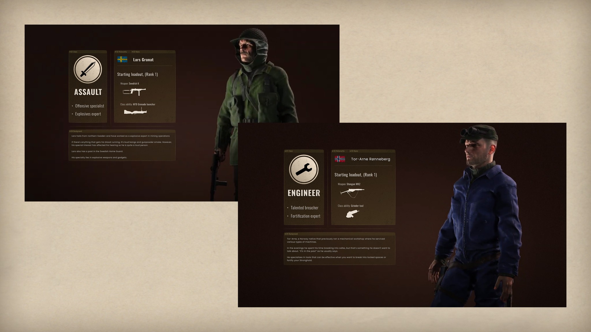
A tiny project I got to work on was about designing a few mockups for some character previews for our devlog; introducing each of the classes you can play as in Striden.
This was a fun challenge in trying to present relevant gameplay and narrative data in short form, as well as quickly designing the layout.
Takeaways
This entire experience of working on Striden was fun, scary, difficult, and all other emotions I can't fathom right now, and it provided an entirely new sense of thought process to me; mostly to how I act and behave as a person and how my work-ethic functions.
I loved the engagement of working closely with all these skilled individuals at the studio and figuring out how to design and create the things we were working on. I enjoyed and focused on being positive, proactive, and nurturing.
I recognized early how my living situation was affecting the output of my work, so I cannot say with confidence that I managed to create my best work; though I attempted it and I tried to be open about it.
More concretely about the work, even though I am happy with the speed at which I managed to design things and that parts were of decent quality, I wish I had put more thought, research, and planning into it:
Once again, I jumped too early into the design work instead of setting up a consistent plan of action in how I would approach the design - could be anything from analysis, information architecture, user stories, personas, etc. Even though I probably wouldn't have had time with this kind of planning initially, I could have probably discussed this with those at the studio. Making the planning stage take more time could affect the actual creation faster in turn.
I didn't adhere consistently to a design style, as it's easy to see how a lot of things vary in line thickness, colors, contrast, and form. I immediately, after my time ended at the studio, set out to work on personal projects to work on this - I have to grow!
Overall, this experience was fantastic with lots of ups and downs and I hope whatever I worked on actually made some impact.
